Table of Contents
New Michelin logo

New Michelin logo
As a result, the thing that comes to mind. Hence, why change a perfectly good and familiar logo?
Michelin Tyres: A History From the Iconic Bibendum to the Stylish Modern Logo
One of the first names that springs to mind when we think of tyres is Michelin. With a history spanning more than a century, Michelin has become well-known for its premium tyres.
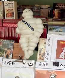
Of course, as well as its eye-catching emblem, which features the cherished Bibendum—or, as the majority of us know him, the Michelin Man. The evolution of this emblem represents the company’s expansion and modernisation as well as shifts in design trends.
Bibendum’s Birth: The Creation of an Icon- New Michelin logo
Bibendum, the original name of the Michelin Man, was born in 1898. According to legend, a stack of tyres caught the attention of the Michelin brothers, André and Édouard, when they were at a trade show.
André said that it would resemble a man if it had arms. After a few years, the company adopted the picture of a tyre man as its logo after being inspired by the stack.
Bibendum wasn’t like any other corporate mascot at the time. He was easily recognised since he was cheerful, strong, and built entirely of tyres. “Bibendum” derives from the Latin “Nunc est bibendum,” which translates to “This is the time to drink.”
In an early Michelin ad campaign, Bibendum was seen holding up a glass loaded with potential hazards on the road, implying that Michelin tyres could safely “drink up” these risks.
The Bibendum’s Development-New Michelin logo
Bibendum has experienced multiple changes throughout the years to accommodate shifting societal norms and consumer preferences.
Earlier depictions of him showed him as a hefty, cigar-smoking man, which is far different from the polished image we see now. His muscular form served as a metaphor for the toughness and longevity of Michelin tyres.
Over the course of the 20th century, Bibendum shrank. Part of the reason for this adjustment was that the character needed to be updated and made more likeable.
He had given up smoking by the 1950s, a sign of a change in people’s habits to healthier ones. His features on his face got more expressive, and his design became more streamlined, giving him a friendlier and more relatable appearance.
The Modern Logo: A Stylish Update
Michelin has chosen to take a more understated approach to their emblem in recent years. The most recent version of Bibendum keeps its core, but in a more polished and straightforward format.
The intricate historical depictions have lost favour in favour of a simpler, more modern aesthetic.
This modification reflects a more general trend towards adaptability and simplicity in business branding. Slick designs are sensible in the digital age, when logos must be scalable and recognised across a range of platforms and devices.
The current Michelin emblem is more context-adaptive, looking good on a website, a mobile app, or a tyre sidewall while still being instantly recognised as Bibendum.
Why Has It Changed?
The Michelin logo evolved as a result of several influences, including:
- Brand Modernisation: Michelin, a leader in tire technology, required a logo that embodied its cutting-edge, inventive nature. The company’s reputation as a progressive industry leader is in line with the new look.
- Versatility : It is simpler to replicate a logo in a variety of mediums. The new design keeps its punch and clarity whether it’s on a smartphone screen, printed on a tyre or featured in a TV commercial.
- worldwide Appeal: A simple, uncomplicated logo cuts through linguistic and cultural divides in today’s worldwide marketplace. It supports Michelin’s global brand identity maintenance.
Giving A Nod to Custom
Michelin has taken care to preserve the essence of Bibendum in its emblem, even with its modernity. Its branding approach revolves around striking this balance between innovation and tradition.
Bibendum is still a much-liked character, representing the company’s heritage as well as its dedication to dependability and quality.
In conclusion, the Michelin logo’s development from the lovably rotund Bibendum of the past to the modern, adaptable design is evidence of the company’s capacity to flourish in a changing global environment.
The fundamental characteristics of Bibendum—strength, durability, and innovation—remain at the centre of Michelin’s identity, despite the logo’s alteration.
You will now be aware of the background to one of the most recognisable images in automotive history the next time you encounter the Michelin Man, whether he is dressed in his traditional or contemporary attire.
Michelin has renewed its logo and visual identity. In short, Bibendum has been reconfigured as modern line drawing rather than the 3D rendering of the decade or so since 2000. At the same time, the …
- Michelin 4X4 CrossClimate
- Winter Tyres-A Women’s guide
- Caravan tyre safety Advice
- Hello tyres, world: Winter Tyres blog
- Effectiveness-Winter Tyres
Source: New Michelin logo
- Michelin 4X4 CrossClimate - April 24, 2025
- Winter Tyres-A Women’s guide - April 23, 2025
- Caravan tyre safety Advice - April 22, 2025

